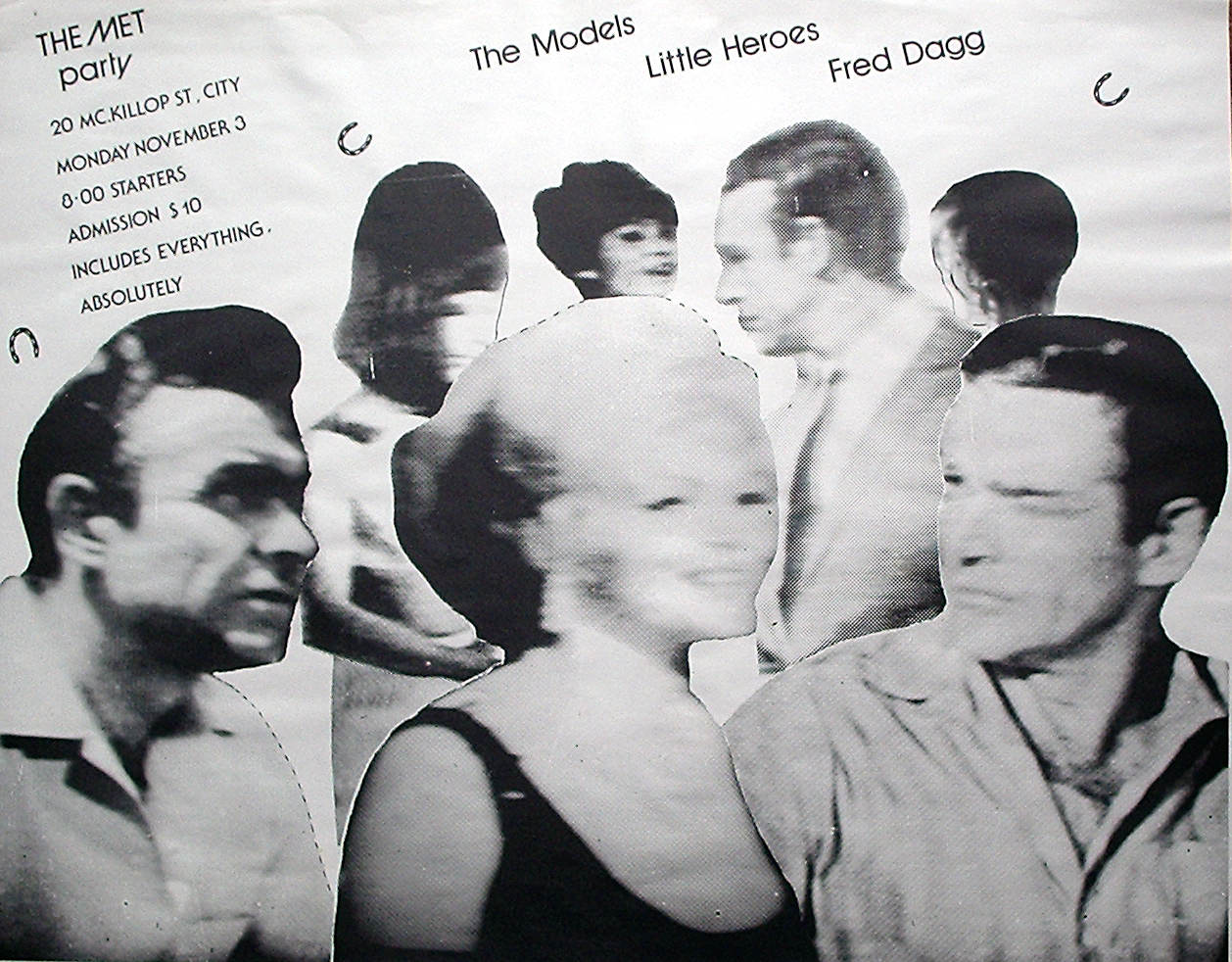
The Met Party
Circa 1979 - 1980
Offset lithograph
102 x 76
I was approached at an exhibition opening by a woman who requested a design for a poster promoting a venue she was hoping to establish. She didn't specify any requirements other than the poster contain horseshoes, a reference to the Melbourne Cup horse race which was scheduled at the time, however I'm no fan of such strategies so I drew them as small as possible.
One element that should have been much larger is the font size. I had no idea that the design was to be plastered on structures such as railway overpasses at a height which made the text impossible to read. This shortcoming had one benefit; the effect of seeing multiple copies pasted up in long rows resembled a big party on a cinematic loop which no doubt made the public curious about the posters' intention.
The client was pleased with the design because she had a strong resemblence to the female I deliberately positioned prominently in the centre of the composition.
The background of the graphics