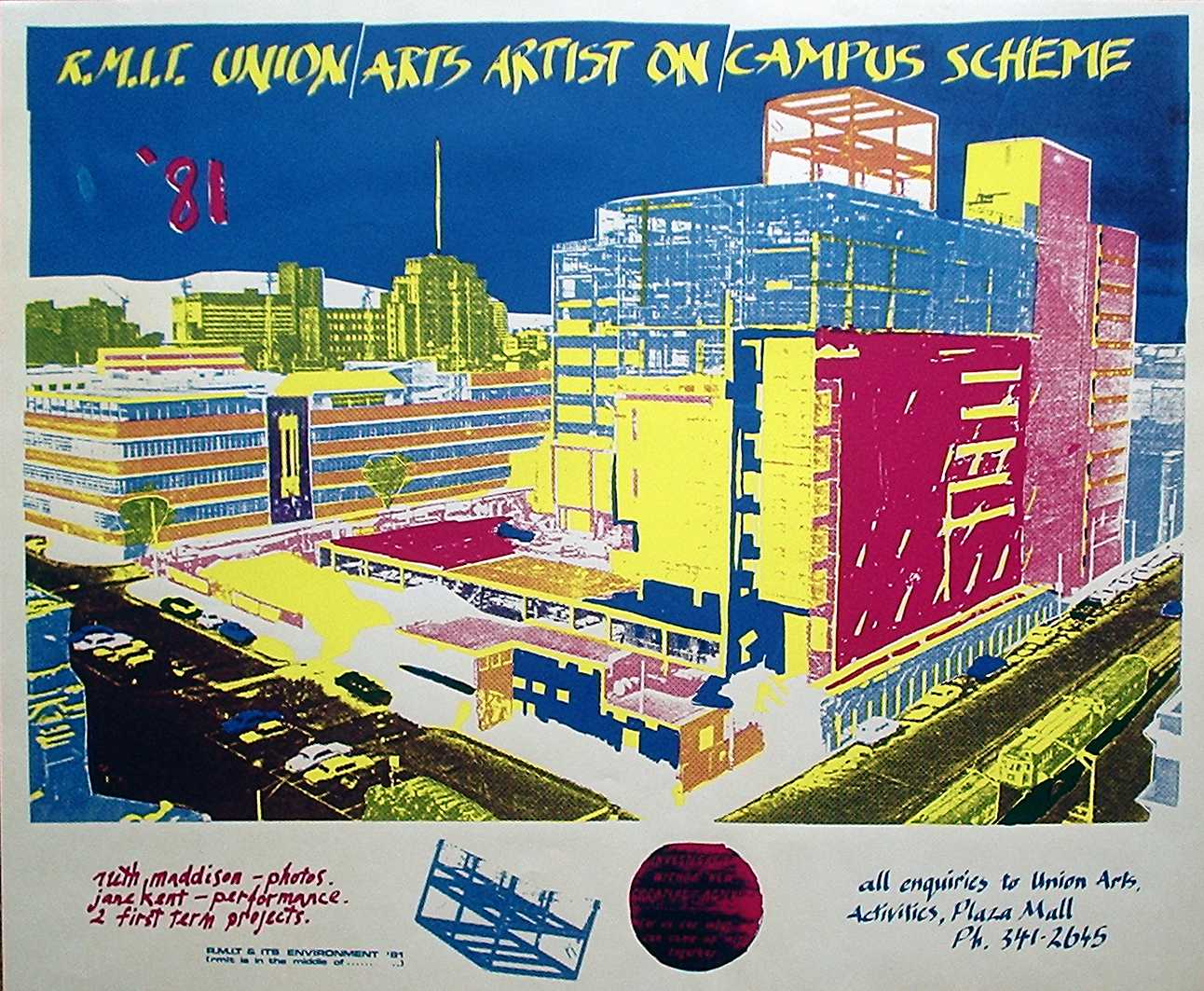
R.M.I.T. Artists on Campus
1981
Screen print
62 x 51 centimeters
Collection National Gallery of Australia
In 1980-81 I was invited by colleague, who had her art studio across the street from mine in Melbourne's central business district, to take over her job working for R.M.I.T. University Union Arts Activities while she travelled in Europe. The Union Arts Activities poster workshop used the popularity of screen printing as an affordable and accessable technology to empower communities creatively. The workshop was available for students who wished to learn the craft of screen printing but the bulk of the poster production was for the publicity of Union Arts events, in this case an artists on campus scheme.
I was told about a campus employee who acted as an informal archiver of the University's history and when I tracked the man down he let me search through his collection of historic photos. My attention was drawn to a photo which I used for this print because it illustrated the high-rise evolution of the campus during some major building projects. Another reason I chose it was the urban environment had been a subject I explored in my personal work during that period.
Time constraints are always an important consideration for poster design and I decided to limit the colours of this design to the basic inks used commercially for colour separations; yellow, magenta and cyan - minus the black. This technique maximises secondary colours and results in a highly saturated colour palette, which is a good thing for posters. However the drawback of the way I used the technique is unpredictable results but fortunately the element of chance delivered a poster which was reported to have been quite popular amongst the student community.
The background of the graphics