The origins of the Saturn Spring folio of screen prints
This project began when I taught printmaking to foundation year art students in the late 1980's. The work roster left a gap between classes and the location of the campus in a dreary suburb meant a lack of interesting activities that could fill a few hours. Moreover, previously I had never had access to the first-rate facilities the college offered and it seemed a shame to waste the opportunity to put them to use.
Straight off, a precise set of criteria were necessary if I were to sucessfully use the break between classes to work on a project. Firstly, I decided to limit the size of the prints to A3 because that was the the graphic art film stock the printmaking studio used and it also offered the benefit of easily transporting the finished prints on the seat of my car. Secondly, it was important to work quickly, I had to be able to clean up and clear the drying racks before the class started.
I have never been very disciplined with artistic decision making, so the requirement of making quick choices forced the use of techniques that delivered immediate results. I could take the work home to study it but when I was in the studio I had to work quite spontaneously. The biggest restriction was the use of one stencil; a photo-stencil which requires time and care to prepare and which I re-used for multiple colours through over-printing and the makeshift use of bits of torn paper to block the passage of ink where needed.
This approach lead to rather painterly results which are atypical of a medium which favours the use of blocks of colour. The very loose colour registration, i.e. the alignment of one colour to the previous layer, plus the unusually absorbant paper stock and the consequent ink bleed it caused also enhanced the painterly surface effect. These techniques are the anathema of good practice for the professional printer and there is one effect which is regarded with particular horror; moire interference patterns. This optical phenomenom was used liberally to build dense textures which confounds the eye in its search for coherent forms.
The nebulous aesthetic is intended to complement a vague narrative if the prints are viewed in order. The first sheets show a woman waking and then moving around until a man appears. He's barely a silhouette seen from behind and they meet in the eighth sheet and when we reach the tenth, the final incoherent conclusion shows chaos, colours and forms are overlaid to such an extent the viewer can can barely discern any meaningful forms.
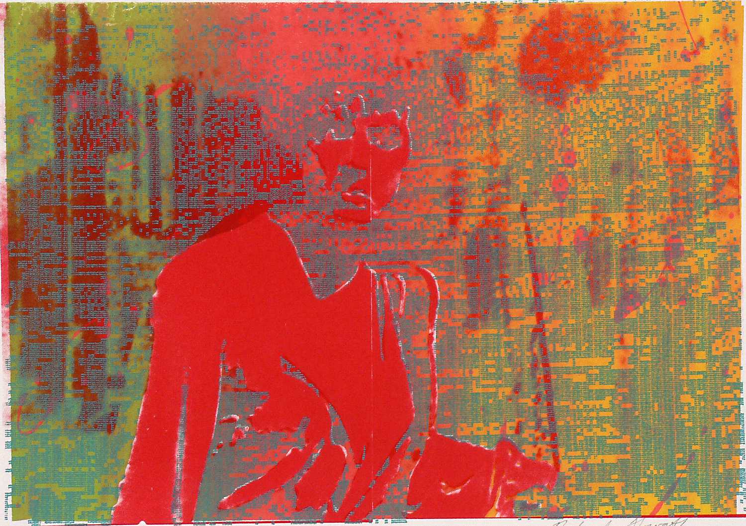
The figures are sourced from a 1950's film noir captured by a film camera which had been set up on a tripod in front of a badly tuned black and white TV. This wasn't a deliberate aesthetic choice, I used whatever means which were available and I found this to be a handy source of images that could be reframed in to an entirely different context from their origin in late night movies. The decomposed images suited my work, any pristine found image would be processed to break down its legibility.
In the image at the head of this page you can clearly see another visual source, one which had hardly been used for art at the time it was made. The background landscape came from a crude low bit-rate computer paint program and my doodlings were output to a piece of technology which had started to fade away by the 1980's, the dot matrix printer. Currently I use fairly sophisticated software for my most recent art but the almost neolithic blockiness of that background is an ideal digital foil for the processed televisual imagery.
As this series evolved, I used the evenings at home to produce the marbled covers. A shallow tray filled with Irish moss was covered with a random pattern formed by diluted oil paint and this was transferred to sheets of paper which were later screen printed with the title. The final step was a bookbinder who made several folios which became the final form of this series.